This project has a visual representation available on my Portfolio.
https://portfolio.owenthe.dev/snow-day-dashboard
This project is describing the frontend dashboard for user customization for the Snow Day Predictor. If you want to instead see project details about the frontend for the predictor, please click here.
The Snow Day Dashboard was my first attempt at making a frontend dashboard, so that users of the Snow Day SMS Service could customize their experience. While the actual technical build of the dashboard is pretty interesting, I miscalculated how to actually build the dashboard. Nobody ended up using it.
The idea behind the Snow Day Dashboard was pretty simple. Users of the Snow Day SMS Service could log into the dashboard to customize how texts are sent, and how often they’re sent. There was good intention behind this – you could make little quality of life changes to your experience, or even hold messages for a bit.
The Snow Day Dashboard was built using the AdminLTE 2 framework (although, as of time of writing AdminLTE 3 is newer). There’s a series of pages for logging in, verifying login via one-time password, and setting certain settings from the dashboard. My portfolio offers a visual of how everything looks.
Behind the scenes, the dashboard communicated with the Snow Day API. The API is extensively used for session management, getting/setting preferences, etc, using a session ID generated at login.
Now that we’re done with the boring stuff – let’s get to the fun stuff. Why the Snow Day Dashboard failed.
In the beginning, the dashboard worked pretty well, was simple, and did what it had to do. And then feature creep settled in pretty hard.
Mistake #1 – Adding too many features
The dashboard should have never contained anything more than a way to change SMS settings. Done. Instead, I added “cool” features, such as the ability to change how the homescreen looked (why??), session management, unsubscribing from the dashboard, and a whole bunch of other crap that didn’t need to exist.
That’s feature creep!
Mistake #2 – Too many damn steps!
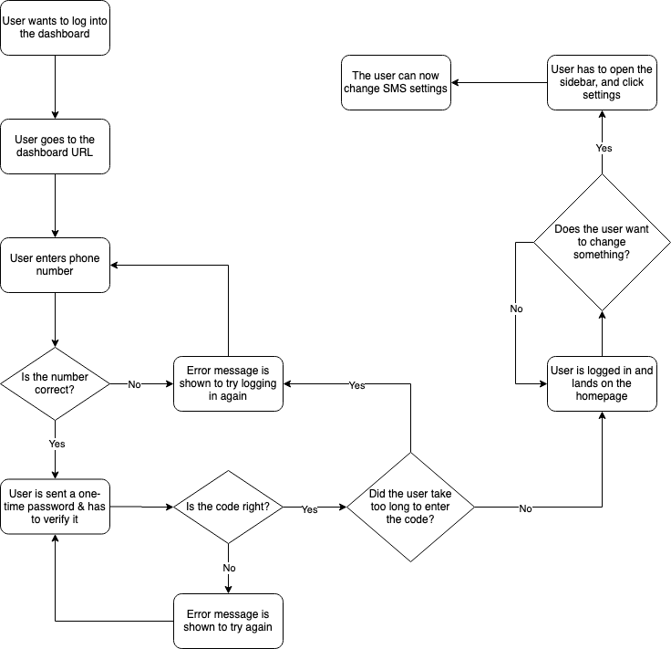
To show you how stupidly complicated the dashboard is for users, I’ve made this flowchart of the login process.
After the dashboard flopped very hard, I had a second thought of a much better way to change settings. Here’s a flowchart of the idea.
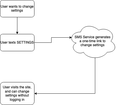
I don’t know about you, but that’s a bit simpler.
Mistake #3 – Prioritizing technical challenges for myself over usability
The Snow Day Dashboard quickly became a fun playground for me to do the most random stuff, without really thinking much about usability. I was never really aware about usability – I knew how to use it, so surely everyone else knew how to use it?
Of course, this logic does not apply in real life. Usability always comes first, not trying to have fun technical challenges.
Mistake #4 – Building a dashboard that would be in use for one year
Since the 2019-2020 season was the last year the SMS Service would be active, it was a huge mistake on my end to pour hundreds of hours into a project that would last for, at most, 5 months.
The best part? The 2019-2020 winter was super lackluster, and we had very few major snow events occur. Even if I did correctly build the dashboard into something much more accessible, it would still be rarely used.
And honestly, that’s it for the dashboard. Yes, it was great to have experience with building something that directly interacts with APIs to save settings, do session management, and to power the entire experience. That’s invaluable, given that I’ll likely be in a similar situation when making many more projects.
Something that needs to be done better? Feature creep management. Having the Snow Day Dashboard made me extremely aware of what feature creep is.
Feature creep is pretty interesting. It doesn’t mean that you’re adding too many features. In the case of track.easterbunny.cc, I added a lot of features that were extremely helpful to the experience of the website, and made it so much better.
Feature creep is adding loads of unnecessary stuff, and making things much more complicated than they needed to be. Sure, it was a fun technical challenge to implement a whole login system – for myself. It also meant an unnecessarily hard login process for anyone trying to log into the dashboard.
And that’s the Snow Day Dashboard. Not my proudest project in a million years.
Source code for the Snow Day Dashboard is available here: https://gitlab.com/o355/snowdaydash
